6 Tips for Intuitive Web Design
Houston Small Business Websites
The basis of our thoughts regarding intuitive web design should be designing pages in a way that leaves none, or at least very few hazards in the path of visitors. This goal is easily achieved with the six following, rather simple measures.
Tip 1: Provide What You Promise
Your visitor enters your site with a critical stance, but also with certain expectations. You’ve probably triggered these expectations with your keyword choices, and maybe, you weren’t completely truthful. Have you promised a bit more than you can offer?
I can understand that you’d try to lure as many people onto your site as possible. Once they’re here, we can still filter them. And maybe, they like what they see, even if it is not exactly what they were looking for.
That doesn’t sound completely implausible. However, the problem is that it doesn’t work. Because, as Nielsen has proven, people lack both the patience and the will to be convinced by a seemingly unsuitable website.
The first element when creating an intuitive website is SEO that makes sure that your website delivers what the search result pages promise to. Any other approach means you lose the trust of your potential visitors before they could even give it to you.
Tip 2: Make it Very Clear What Your Website is About
Listen to the marketing people when they talk about the importance of the call to action. They are right. You want your visitors to do certain things. So, don’t make them guess what you want them to do, but put your website’s goal into the foreground.
The erotic store around the corner doesn’t have coffee machines in the shop window either, and won’t surprise you with the actual offer upon entering.
Tip 3: Be Predictable
Intuitive controls are partially based on the simplicity of the process, but also based on sticking to an established convention when it comes to the design. Now, what exactly we should consider established conventions varies. Take a look at the best practices of your branch, and stick to those.
Your visitors want a unique user experience. However, that shouldn’t include having to take extraordinary paths to get to the result. Instead, you should make sure that they can quickly get to their goal without reading a manual. Thus, use traditional approaches rather than brand new innovations when it comes to the navigation and user guidance.
If you were to go to a toilet somewhere you’ve never been before, and there was a room without light switches, faucets, or a flushing toiled, would you be happy, even if it looked futuristic?
Something similar happened to me last summer, in the restaurant of an Italian mountain village. I went to the toilet and was about to wash my hands at the tap. No faucets, no sensors, nothing. After a while, I found a foot-operated switch on the floor. Did the solution do its job? Yes. But, was I impressed?
You know the answer. Don’t make the same mistake on your website.
Tip 4: Don’t Build Unnecessary Interactions
The former RTL boss Helmut Thoma once made a provoking but fitting statement: “The only interaction today’s TV viewers want is the one with their fridge.” And, even if it sounds harsh for us web workers, it still holds true today.
The attempt to impress visitors with neat, technological toys will fail. The attempt to turn visitors into customers via social media or gaming components will fail as well. Although I’ll happily admit that the latter statement may very well turn into a false statement in the next few years. We’re living in an age of fast transformation, after all.
Now, don’t confuse the term “unnecessary interaction” with the term “micro interaction”. Just recently, I advised you to make heavy use of the latter, as they can make the difference between two equal solutions for the same application case.
A good micro interaction could be a purchase button, which turns green upon clicking or tapping it, reanimating a confirmation checkmark. This would tell the client that he hit the button and that the ordering process was successful. However, and I’ve already seen this myself, it would be unnecessary for the purchase button to literally fly into the shopping cart icon, making it rotate. You know what I mean…
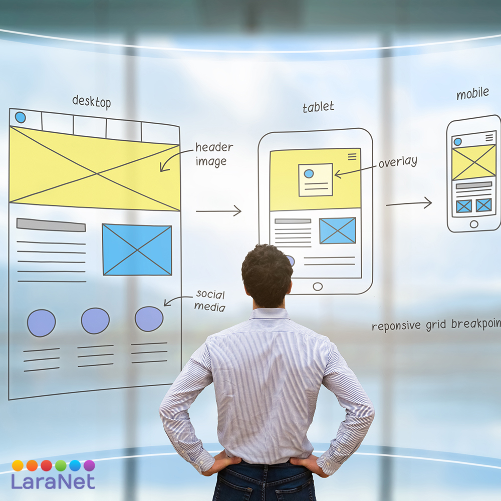
Tip 5: Be Minimalistic, and as Device-Independent as Possible
Essentially, the goal is to keep your website as slim as possible. You don’t want to blast your visitor with all information possible, but rather focus on the essential information.
Now, if you also stick to these design principles, there’s not much that can go wrong. Well, you may want to look into microinteractions. After all, they are crucial to success.
Since the number of those purely surfing on mobile has exceeded the number of users purely surfing via desktop computer, responsive design, which is a layout that adjusts to the respective device, is no longer a question of preference. The next evolutionary step of responsive design could be the increasingly more popular, and increasingly better supported progressive web apps.
This is intuitive web design as well.
Tip 6: Don’t Demand Unnecessary Information
If you run a digital paid service and offer a free trial to your potential customers where you want to convince them of the product in a non-binding fashion, you’re already doing a better job than the competitor that only offers a personal presentation upon request and with a fixed date.
However, your offer only becomes really good once you even avoid hazards here, and don’t ask your potential customer to enter a valid method of payment at the beginning of the testing period. You’ll see that the number of people deciding on a truly nonbinding test is much higher than any other method could ever get you.
The new EU General Data Protection Regulation, which comes into full effect on the 25th of May 2018, will motivate you in that regard as it is. Because if there’s one thing to take away from the GDPR, it’s the aspect of data economy. This means that, in the future, you can only demand data from interested users that is needed for the respective data processing.
An example: What do you need to send an e-book to a potential client? Exactly, an email address, but that’s it. Sure, a lead is hard to generate from this, but this is a very different topic. Just think of something better
About LaraNet: We are a web design firm focused to help you to grow your business and communicate with your customers and prospects using two simple but powerful tools: 1) Interactive Website and 2) Internet Marketing Strategy on social networks like Facebook, YouTube, Twitter, LinkedIn, etc… Whether you want to work with just a web page, or launch or improve your presence on Facebook, Google+, LinkedIn or communicate with your customers through newsletters, or improve the location of your business in the search engines through Search Engine Optimization, or start marketing your products or services online, in LaraNet we can help you.